GlowMama
Research, UX, UI, Prototyping
Apps overwhelm users from the start with too much data and too many steps. Tracking numbers lack context — users see metrics but don't understand what they mean. Key features like growth tracking, workouts, and appointments feel scattered across separate tools. Emotional support is largely absent, leaving users without guidance or community during a sensitive journey.
A guided onboarding flow that asks only what matters, reducing friction from the first screen. A home screen that gives tracking data real meaning — baby size, key metrics, and a personal greeting. A unified structure that brings tracking, lifestyle, and planning into a single coherent experience. A supportive tone and community space that makes users feel understood, not just informed.
GlowMama is a concept project where I explored how thoughtful design can make pregnancy apps feel more supportive and personal. Many existing apps overload users with information or feel generic. My goal was to create an experience that guides expectant mothers from the very first screen, offering clear onboarding, personalized tracking, and a safe community space.
This project allowed me to practice the full design process — from research and personas to prototyping and visual design — while focusing on empathy and simplicity.
I conducted user interviews to understand what pregnant women actually experience and what they need from an app. The goal was to move past assumptions — talking directly to first-timers, busy professionals, and women who like to track their progress gave me a clearer picture of their frustrations and expectations.
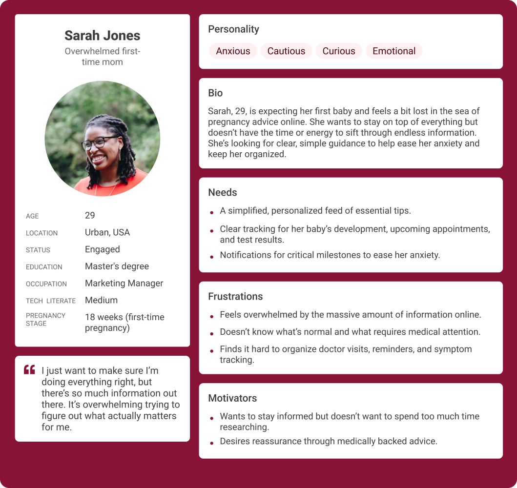
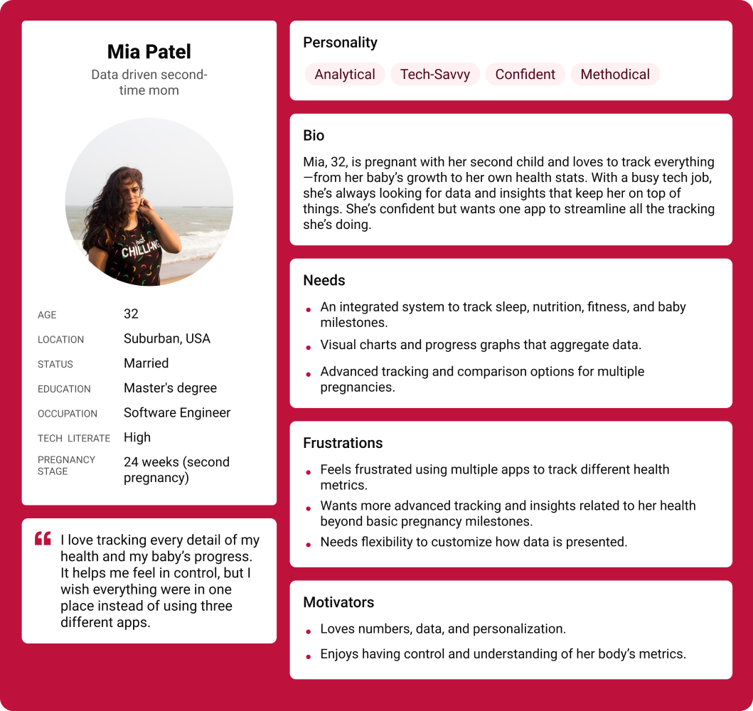
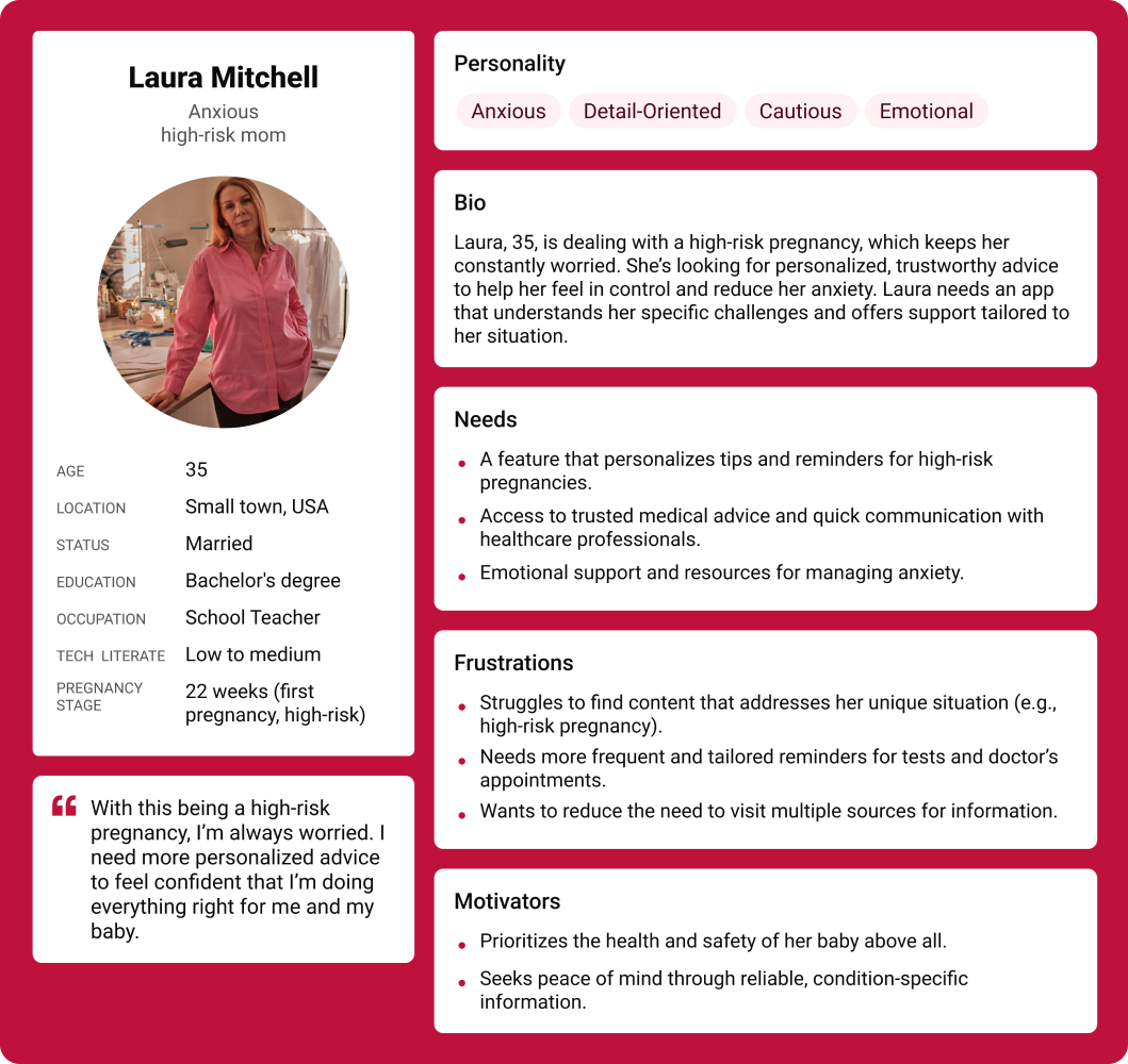
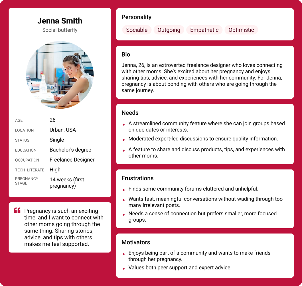
I identified five key personas based on initial research — ranging from the inexperienced first-time mom to the data-driven second-time mom. Each represented a distinct set of needs, stress points, and behaviours that shaped how I approached the design.
Overwhelmed first-time moms prefer simple, step-by-step guidance over information-dense experiences.
Data-driven moms want advanced tracking and detailed logs to feel in control of their progress.
High-risk moms seek reassurance — personalized content and easy access to medical guidance matters most to them.
Busy working moms need a streamlined experience — they don't have time to dig through menus or read long articles.
Conflicting advice online leaves first-time moms confused about what to actually trust.
No single app covers health, symptoms, and baby development — users juggle multiple tools.
Online communities lack moderation, making it hard to find reliable, expert-backed answers.
Simplified stage-by-stage guidance for first-time moms.
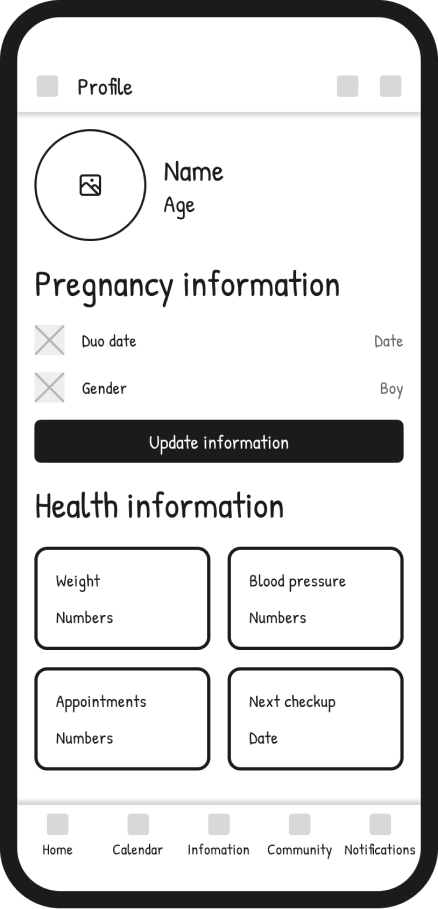
Personalized health insights based on the user's profile and stage.
All-in-one tracking to eliminate the need for multiple apps.
Expert-led communities that feel trustworthy and moderated.
Feedback from busy moms led me to design a quick-view dashboard that puts the most relevant information front and center — no digging required. Understanding that high-risk moms need reassurance pushed me toward personalized health insights and an easily accessible emergency contact feature.
The app needs to balance medical reliability with approachability, ensuring that all pregnancy information feels trustworthy yet friendly for users. It's challenging to retain engagement across all pregnancy stages, as users' needs and emotional states change drastically throughout their journey. The product must find ways to monetize ethically, offering value-added features (like premium insights or expert consultations) without compromising user trust. Establishing a consistent visual and brand identity that appeals to a wide demographic of pregnant women is crucial for long-term recognition.
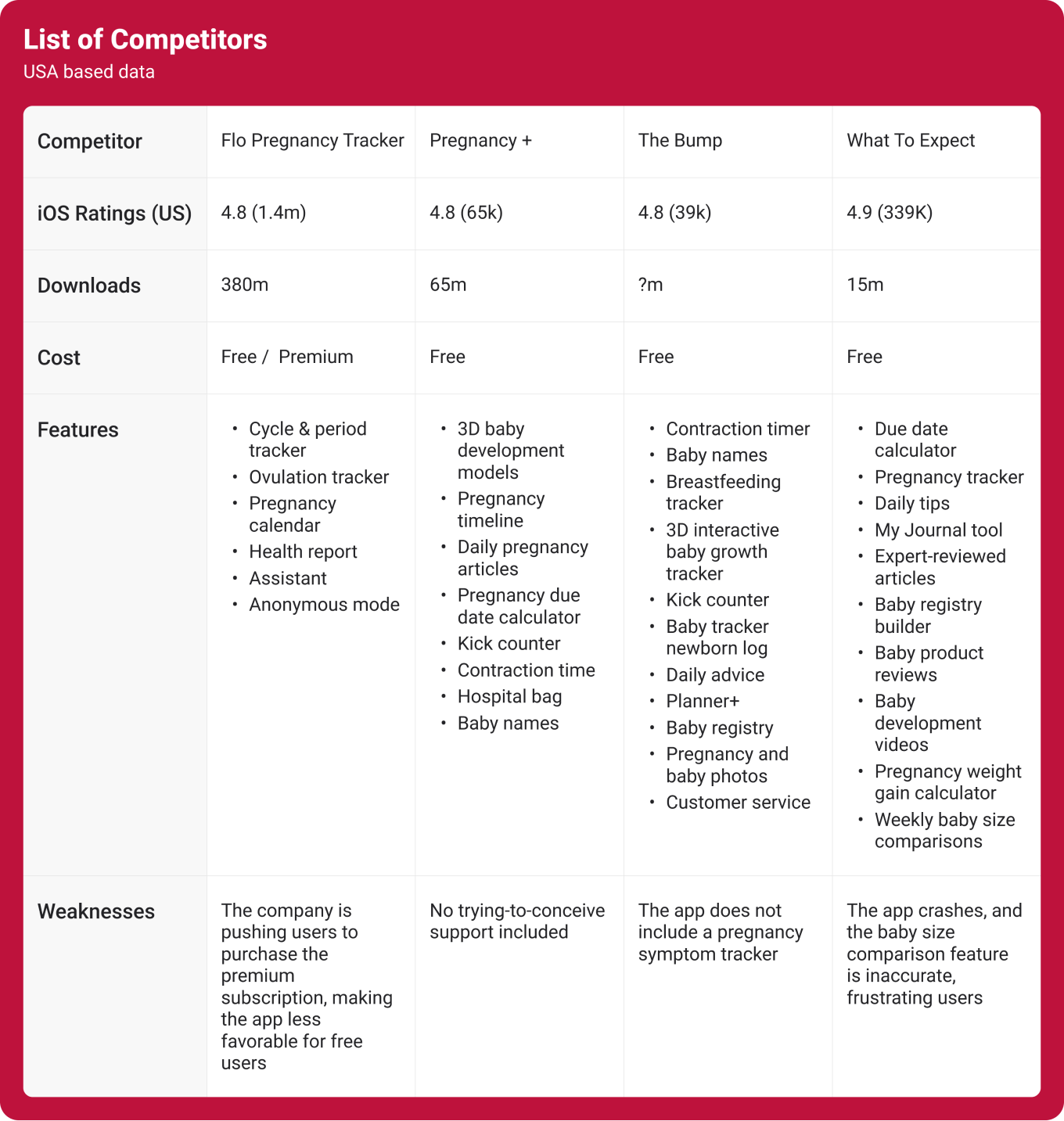
This competitive analysis looks at some of the top pregnancy apps to see how they compare in terms of features, user experience, pricing, and more. By examining what these apps do well and where they fall short, I can identify opportunities to improve my own app and offer something unique. The table highlights key areas like community engagement, customization options, and content quality, helping me understand the market and how I can better meet users' needs.
I've created user personas to better understand the different types of pregnant women who might use my app. By exploring their goals, frustrations, and habits, I can design a product that speaks directly to their needs.
Moms-to-be who want a simple, supportive way to navigate pregnancy. Whether it's their first time or they're juggling work and family, they're looking for clear guidance, easy tracking, and a community that understands them.
Users need a clear and simple way to understand what truly matters during each stage of pregnancy, without feeling overwhelmed by information.
Users need a personalized experience that adapts to their pregnancy stage, preferences, and lifestyle, making the app feel relevant and supportive.
Users need an easy and visual way to track their baby's growth and progress, so they can feel more connected and reassured throughout their journey.
Users need a safe and encouraging community where they can share experiences, get emotional support, and feel less isolated.
To resolve user needs — designed around three core pillars:
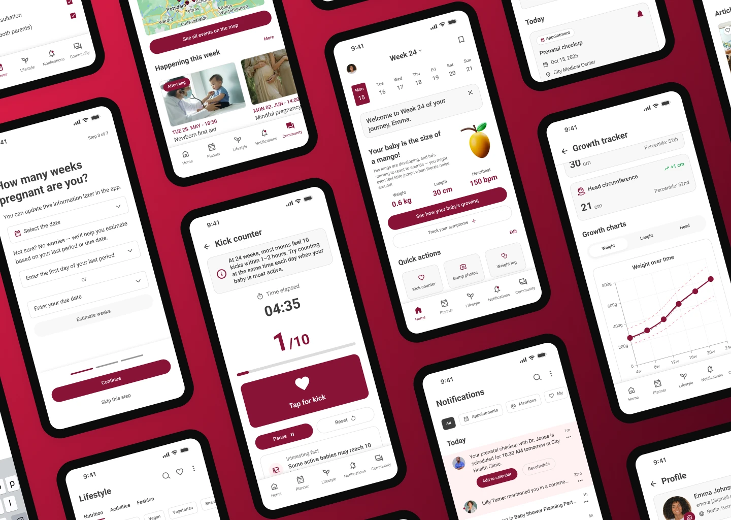
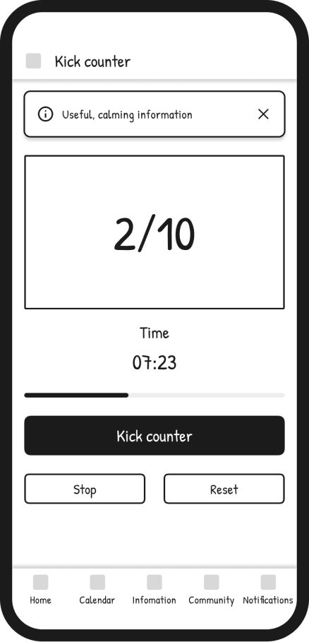
A smart way to monitor daily symptoms, baby growth, and emotional changes. It helps users understand their progress, notice patterns, and gain a clearer overview of their pregnancy journey through data and visuals.
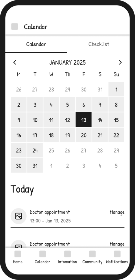
A central hub that organizes doctor appointments, upcoming events, and pregnancy milestones. It supports better planning and gives users a simple overview of what's ahead during each stage.
A dedicated space for sharing insights, asking questions, and learning from other moms in similar stages. It builds a sense of support and belonging while providing access to real experiences and helpful advice.
After reviewing the research and feedback, I started creating simple wireframes to explore the structure of the product. This helped me turn the insights into clear screens and flows. It also made it easier to see what worked, what needed to change and where the design could move next.
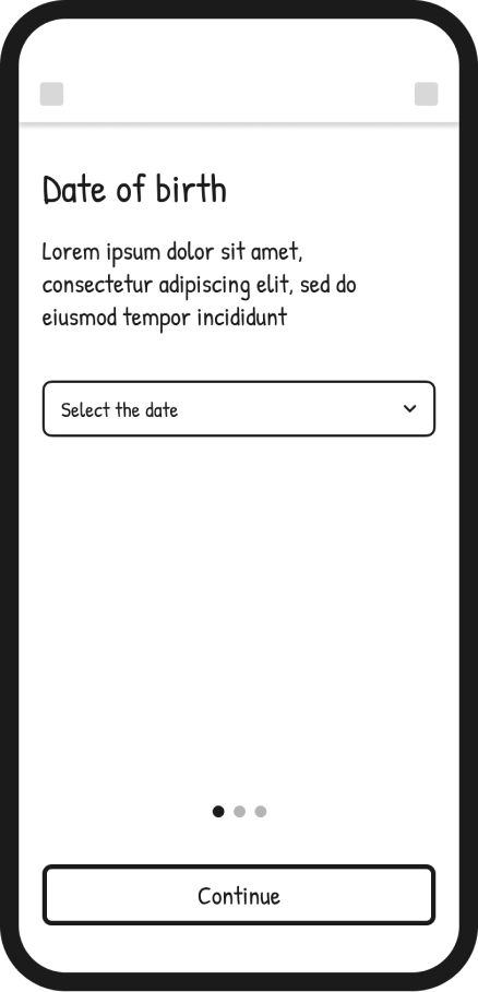
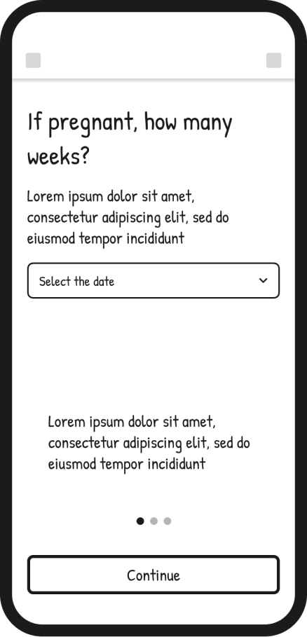
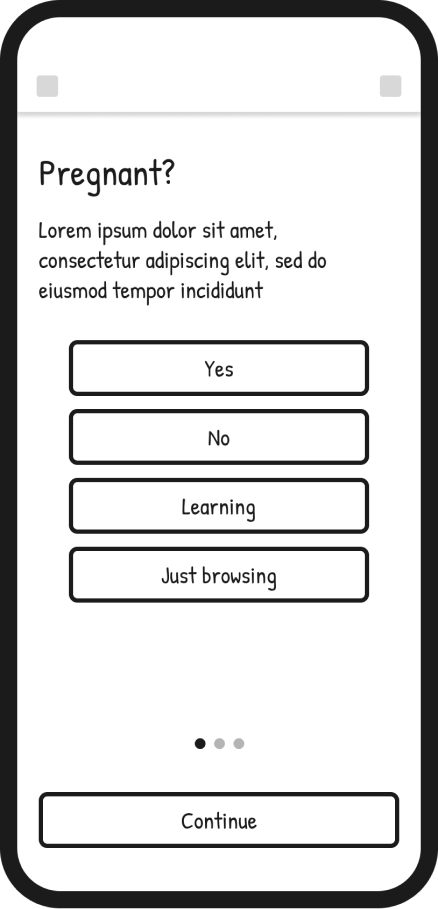
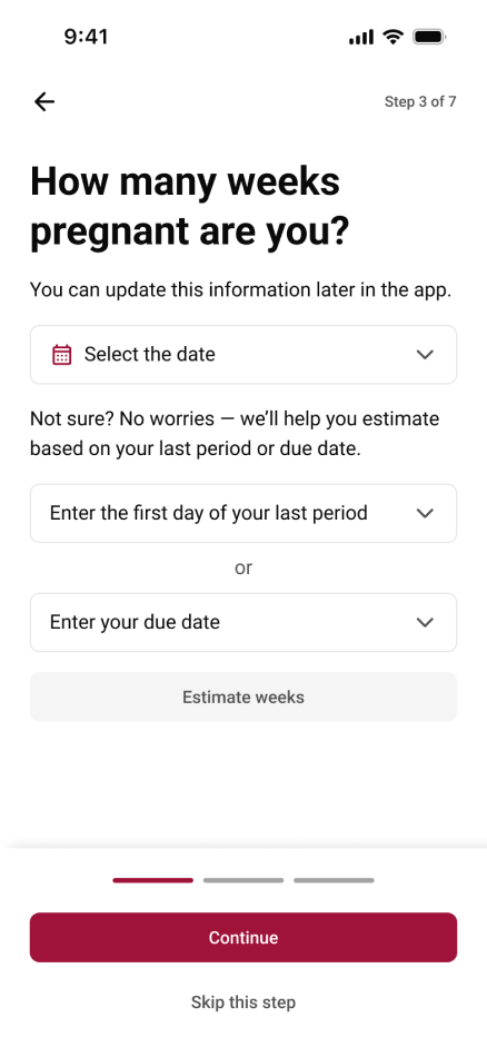
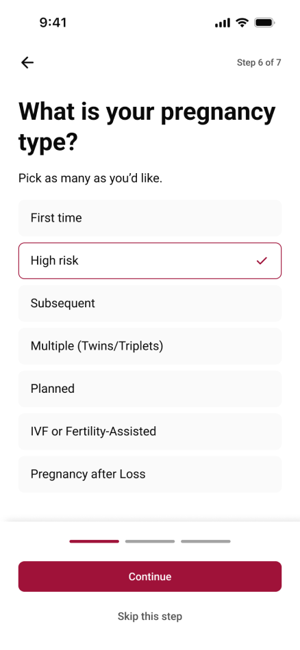
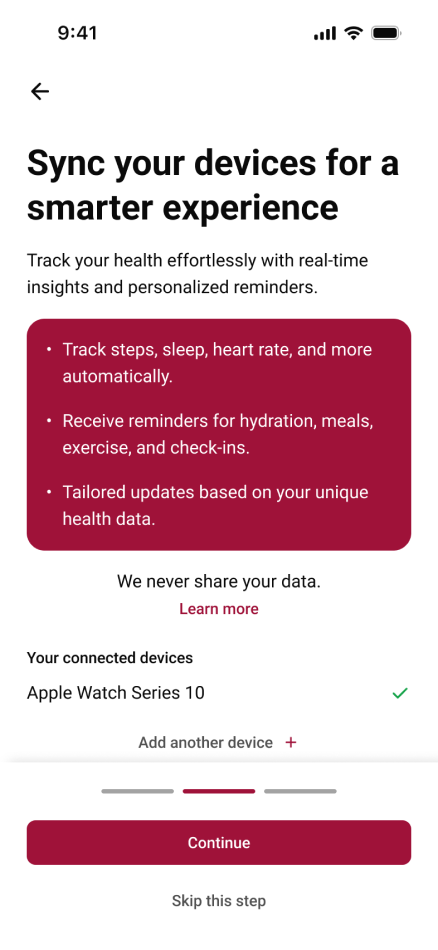
I identified onboarding as a critical step in guiding users and creating a clear, supportive experience from the start.
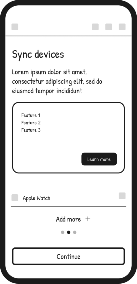
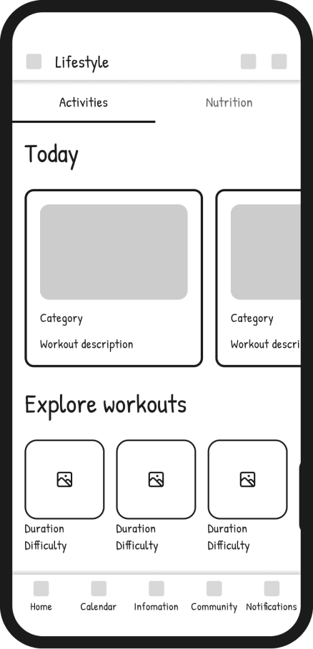
I then focused on introducing core features that help users track pregnancy progress in a simple and meaningful way.
Finally, I explored activities and community interactions to support connection, engagement and ongoing use of the app.
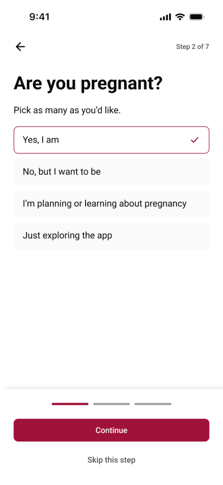
From the beginning, I knew the onboarding experience had to do more than just ask for information — it had to set the emotional tone for the entire app. Pregnant women often switch between excitement and anxiety, and I wanted GlowMama to feel like a gentle guide, not just another form to fill out.
I focused on keeping the flow simple, conversational, and reassuring. Instead of overwhelming users with too many questions, the onboarding gradually collects just what's needed to personalize their journey — like due date, pregnancy week, and daily preferences. Each screen is designed to feel light and celebratory, helping users feel seen and supported from the very first tap.
This process taught me that good onboarding isn't about efficiency alone — it's about building trust. By creating a calm and caring first impression, GlowMama immediately communicates what the whole app stands for: a companion that understands and supports you through every stage of pregnancy.
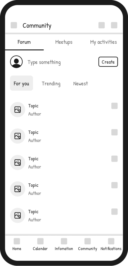
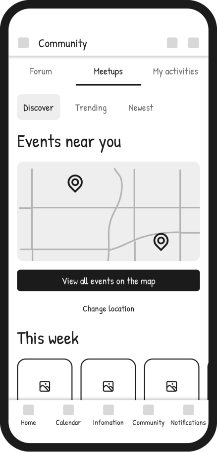
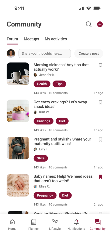
When I started designing the Community section, I wanted to solve a problem I noticed in most pregnancy apps — they track symptoms and weeks very well, but they often feel lonely. Pregnancy is such an emotional, uncertain, and beautiful time, yet most digital tools focus purely on data and not enough on connection.
The goal
My goal was to design a community that feels small and trustworthy, not just another feed of endless posts. I wanted users to find comfort in shared experiences, feel encouraged to ask questions, and discover events nearby that bring those online connections into the real world.
The design approach
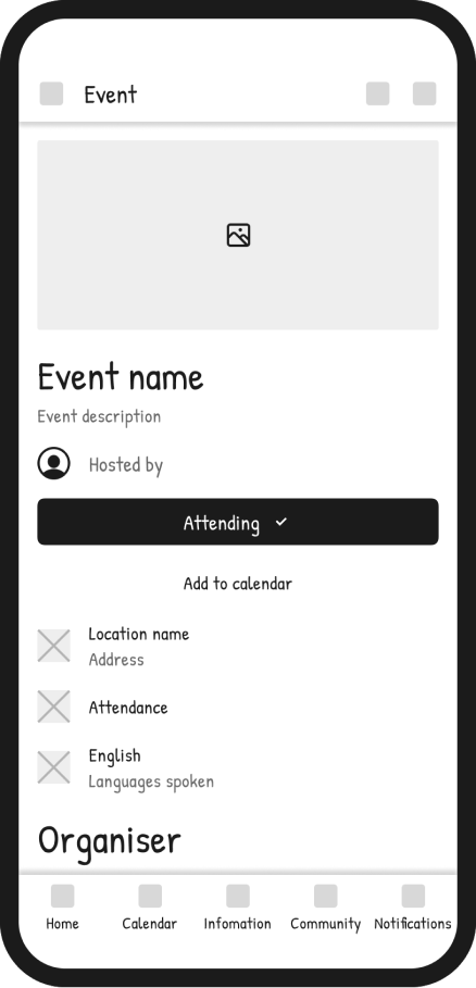
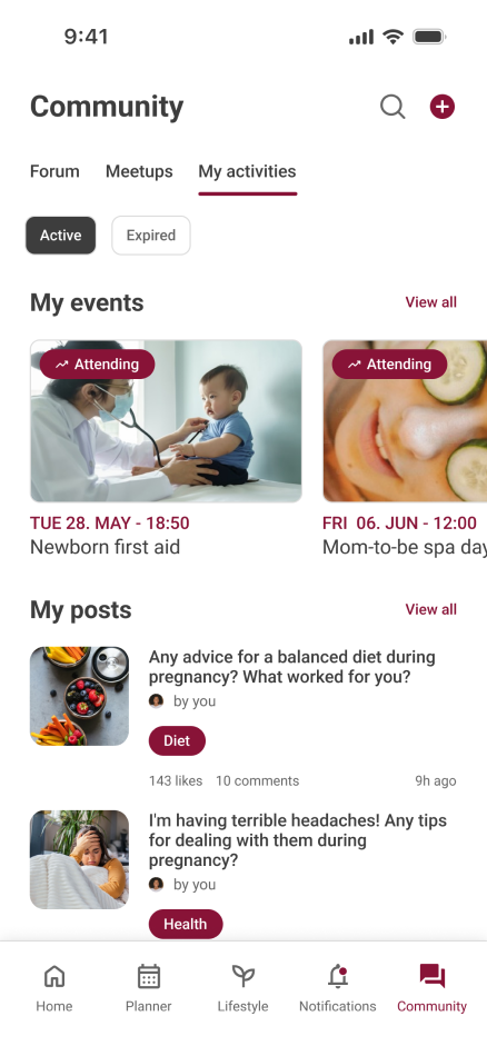
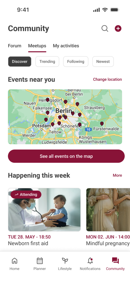
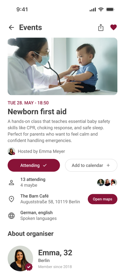
Forum: for open discussions and shared advice. Meetups: to discover and join local events, from prenatal yoga to newborn first aid courses. My activities: a personal space where users can see their posts and upcoming events — a small way to create ownership and continuity in their journey.
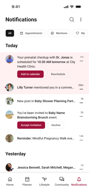
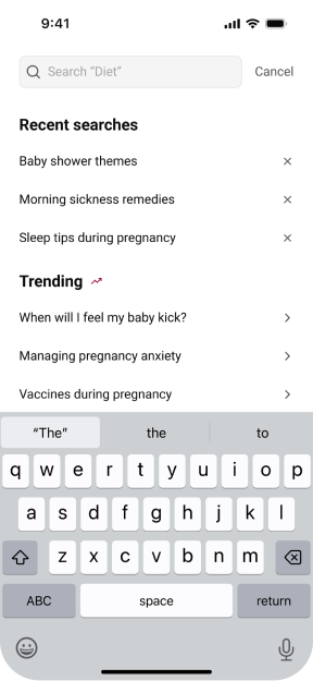
I added search and notifications to make the app more proactive and supportive. The search screen helps users instantly find trusted information through recent searches and trending topics, saving time and reducing stress. The notifications screen keeps them on track with clear reminders about appointments, milestones, and community updates. Together, these features turn the app into a smart companion that guides pregnant women every step of the way.
Even though this was a concept project, I focused on what design outcomes could look like and reflected on what I learned through the process.
The detailed onboarding flow helped users feel guided rather than overwhelmed, reducing uncertainty in the first steps of the app. Personalization features (pregnancy type, goals, notifications) created a sense of control and reassurance. The community hub design showed how a forum + local meetups could bring users together in a safe, moderated way. Overall, the concept demonstrated how small design decisions — like offering an "I'm not sure" option or letting users set preferences early — can make the app feel more human and trustworthy.
Onboarding is not just about gathering information — it's about building trust and comfort in the very first minutes of use. Pregnant users value simplicity over quantity; the right information at the right time is more impactful than an overload of features. Community features need to feel safe and moderated to be effective — tone and visual language matter just as much as functionality. Working on this concept taught me how to balance empathy with usability, and how to translate user needs into a clear, calm product experience.
I would be introducing a partner experience, allowing users to invite their partner to join and stay connected throughout the pregnancy. Many women mentioned that their partners wanted to be more involved but didn't always know how. By syncing accounts, both could share progress, milestones, and reminders in a simple, supportive way.
The goal would be to make pregnancy feel like a shared journey, not just an individual one.