TorAlarm
User research, interaction design, onboarding and personalization flows, home screen redesign, design system, A/B testing, cross-functional collaboration.
TorAlarm lacked a unified way to follow teams, forcing users through deep menus for basic actions. This increased friction and reduced long-term engagement. After surveying feedback and analytics, we knew a more personalized destination was needed.
Make TorAlarm one of the most intuitive and personalized football scores and news app for fans worldwide, where following teams and competitions feels seamless and tailored from first use onward.
TorAlarm is a football results and news app where personalization was fragmented and easy to miss. We restructured the experience around team loyalty instead of competitions, aligning the product with how fans actually follow football. Onboarding became a clear entry point for intent, allowing users to select favorite teams and control notifications from the start.
Within the first year, 31 percent of users selected a favorite team, showing strong adoption and enabling more relevant notifications and a more tailored home experience.
More broadly, this work shifted the app from a generic score tracker to a more scalable, intent-driven product system.
Over the past three years at TorAlarm, I focused on making the app feel more personal and relevant to each user. I approached this by combining user research, questionnaires, data insights, and direct feedback from our community to understand how people actually follow football.
This was an ongoing process rather than a single redesign. Each iteration helped shape an experience that adapts to users' preferences, strengthens their connection to the teams they care about, and evolves alongside their habits.
We conducted a high level review of direct competitors such as FlashScore, LiveScore and SofaScore, as well as broader sports platforms like Sky Sports, Champions League, Bundesliga and Premier League apps, to understand how fans currently follow teams and players. While these apps offer a large amount of data, we noticed that many experiences rely on dense layouts and layered navigation, which can feel overwhelming.
This highlighted an opportunity for TorAlarm to focus on clarity and speed. Instead of adding more information, we aimed to reorganize existing content around teams and personalization, making it easier for users to access what matters most to them with fewer taps and less cognitive effort.
Competitor apps and TorAlarm's earlier structure were heavily competition driven. Research, user feedback, and usage patterns showed that most users primarily care about a small number of teams and want to follow them across all competitions. This created an opportunity to shift the experience toward team centered navigation and consolidate scattered information into a single destination.
Without a clear moment to express preferences, personalization remains hidden and underused. Feedback and data showed that users wanted customization, but often discovered it too late or not at all. This highlighted the importance of onboarding as a deliberate starting point, where users could signal intent early and shape their experience from day one.
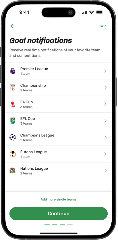
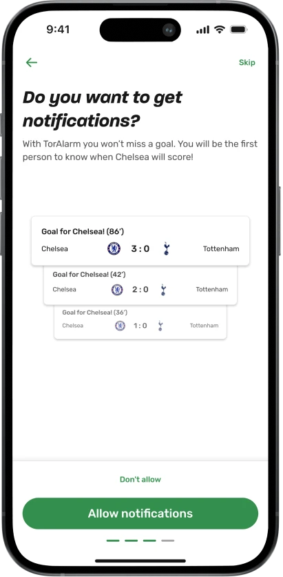
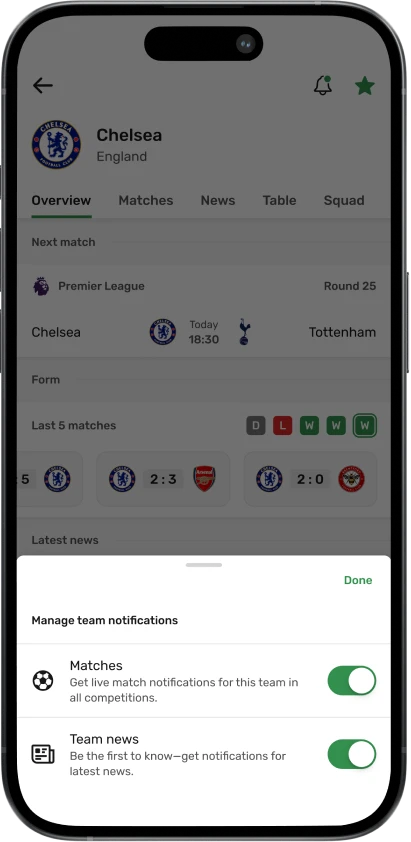
Notifications were one of the core reasons users returned to the app, but competition based logic often led to missed or inconsistent updates. This revealed an opportunity to simplify notification rules around teams rather than competitions, making alerts more predictable, timely, and relevant. Team based notifications allowed us to increase opt in rates and send more meaningful pushes without increasing noise.
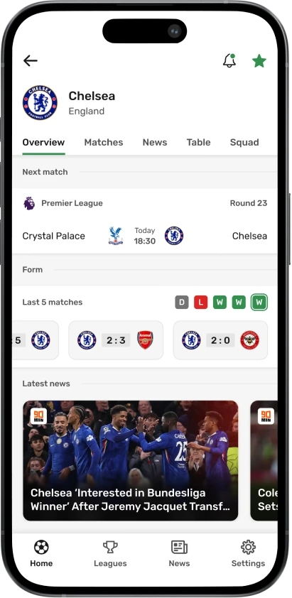
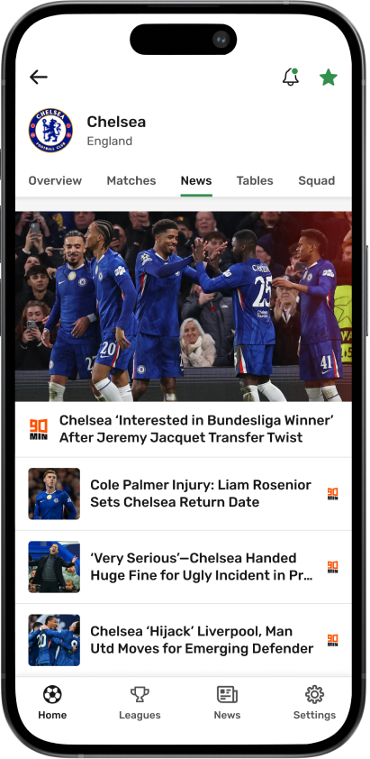
On match days, users want immediate access to their teams, live matches, and key information. Feedback showed that navigating between multiple screens created friction and slowed users down. This insight drove the home screen redesign, prioritizing favorites, live matches, and day based navigation so users could reach what they care about with a single tap.
Logos, colors, and visual accuracy are not cosmetic details for football fans. Inconsistent or incorrect visuals reduce trust and emotional connection to the product. This insight reinforced the importance of maintaining high quality assets across all teams, regardless of size, to support credibility and long term loyalty.
To ground our design decisions in real user behaviour, I implemented a two-phased research plan. Initially, I ran remote unmoderated usability studies to benchmark the existing design and identify key pain points. Later in the process, I collaborated with the research team on moderated studies that simulated a live match-day experience. This allowed us to validate our new design concepts under pressure and ensure they were intuitive for both casual fans and experienced bettors.
Logos and colors are some of the most frequently seen elements in a football app. When I joined, many team and competition logos were outdated, low quality, or visually inconsistent, often with incorrect backgrounds or proportions. This negatively affected perceived quality and trust in the product.
I took full ownership of improving and maintaining these visual assets. Over the past three years, I sourced and updated more than 3000 team and competition logos, ensuring consistent quality across the app. This included actively engaging with football communities to stay up to date with rebrands, badge changes, and new teams. The result was a more polished and reliable visual experience that scaled with the product.
I did not treat this work differently based on the size or popularity of a club. A top tier team and a small club appearing once in a national cup deserve the same level of care. For many fans, that first appearance in the app can be the start of a long term relationship. Designing with that mindset helped ensure every user, regardless of who they support, received the same quality experience.
Beyond the user facing impact, building a structured logo library significantly reduced manual work for the content team. Logos no longer needed to be sourced individually for new teams or competitions, allowing the team to focus more on match quality, coverage, and news instead of asset maintenance.
Example of how I organize and maintain team logos. Shown here are English clubs across different leagues.
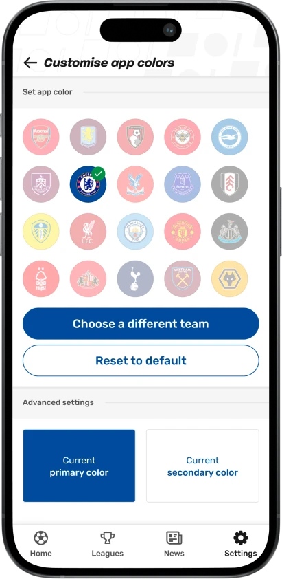
Team colors already existed in the app, but their usage was inconsistent and many color values were outdated. The system relied on primary and secondary colors in ways that often caused poor contrast, especially on buttons, where text became hard to read.
To solve this, I simplified the approach. I standardized the use of the primary team color and paired it with either white or black text, depending on contrast. This improved readability, accessibility, and consistency across the interface, particularly in high pressure contexts like live matches.
For football fans, color accuracy is not a small detail. Team colors are part of identity and recognition. Using incorrect or washed out colors breaks trust and weakens the emotional connection fans have with their team. A Dortmund fan will forgive a missed chance, but not the wrong shade of yellow.
By updating and correcting team colors across the app, I reinforced that emotional connection while also improving usability. This work also strengthened our premium offering, which allows users to recolor the app based on their favorite team. With accurate colors and reliable contrast, the feature felt intentional, usable, and aligned with the overall quality of the product.
When I joined, the app had no clear entry point for personalization. Users could enable notifications, but the experience was fragmented and easy to miss, which made the product feel generic from the first session.
Onboarding was one of the first features we introduced at TorAlarm since I joined the team. Research, data, and user feedback showed that new users were not clearly guided toward a personalized experience, despite actively asking for more customization, especially around following favorite teams.
We treated onboarding as a critical moment to understand user intent and begin shaping the app around individual preferences. We worked closely with stakeholders to balance user needs with business goals, and collaborated with the engineering team to explore technical possibilities and constraints early on. This alignment helped us design an onboarding flow that was flexible, scalable, and realistic to implement.
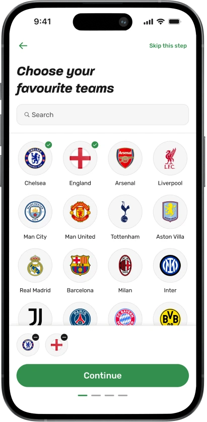
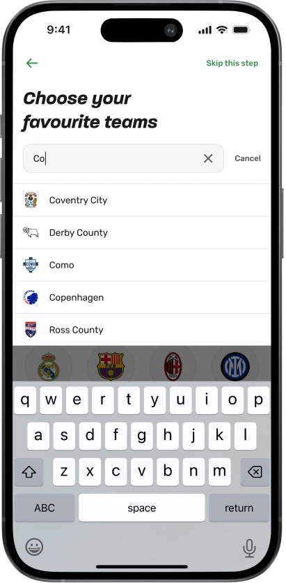
Through multiple iterations and extensive A/B testing, we explored how and when to introduce customization without overwhelming users. We experimented with different onboarding structures, page order, copy variations, and by adding or removing steps to understand what encouraged users to stay engaged rather than dropping off after first use.
The first screen focused on favoriting a team, while still respecting users who wanted to move quickly into the app by offering a clear option to skip onboarding.
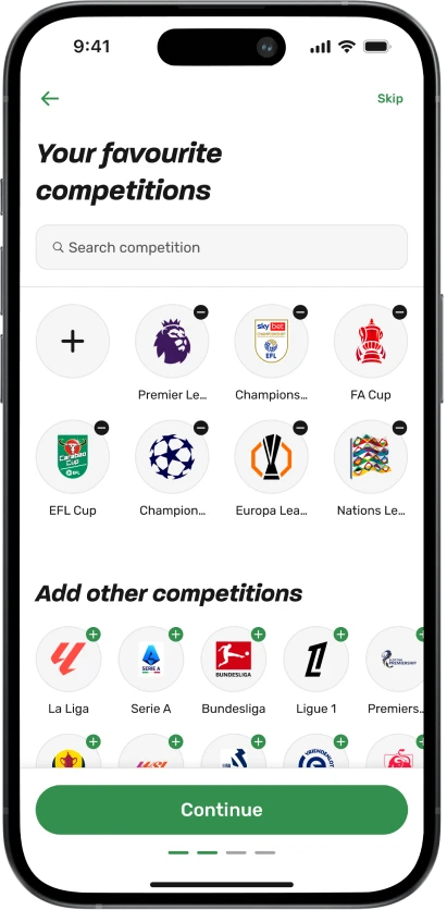
This setup allowed us to measure how many users chose to personalize early, how they interacted with default competition and notification settings, and which onboarding variants were most effective at retaining users beyond the first few days. These insights shaped the final onboarding flow and informed future personalization features across the app.
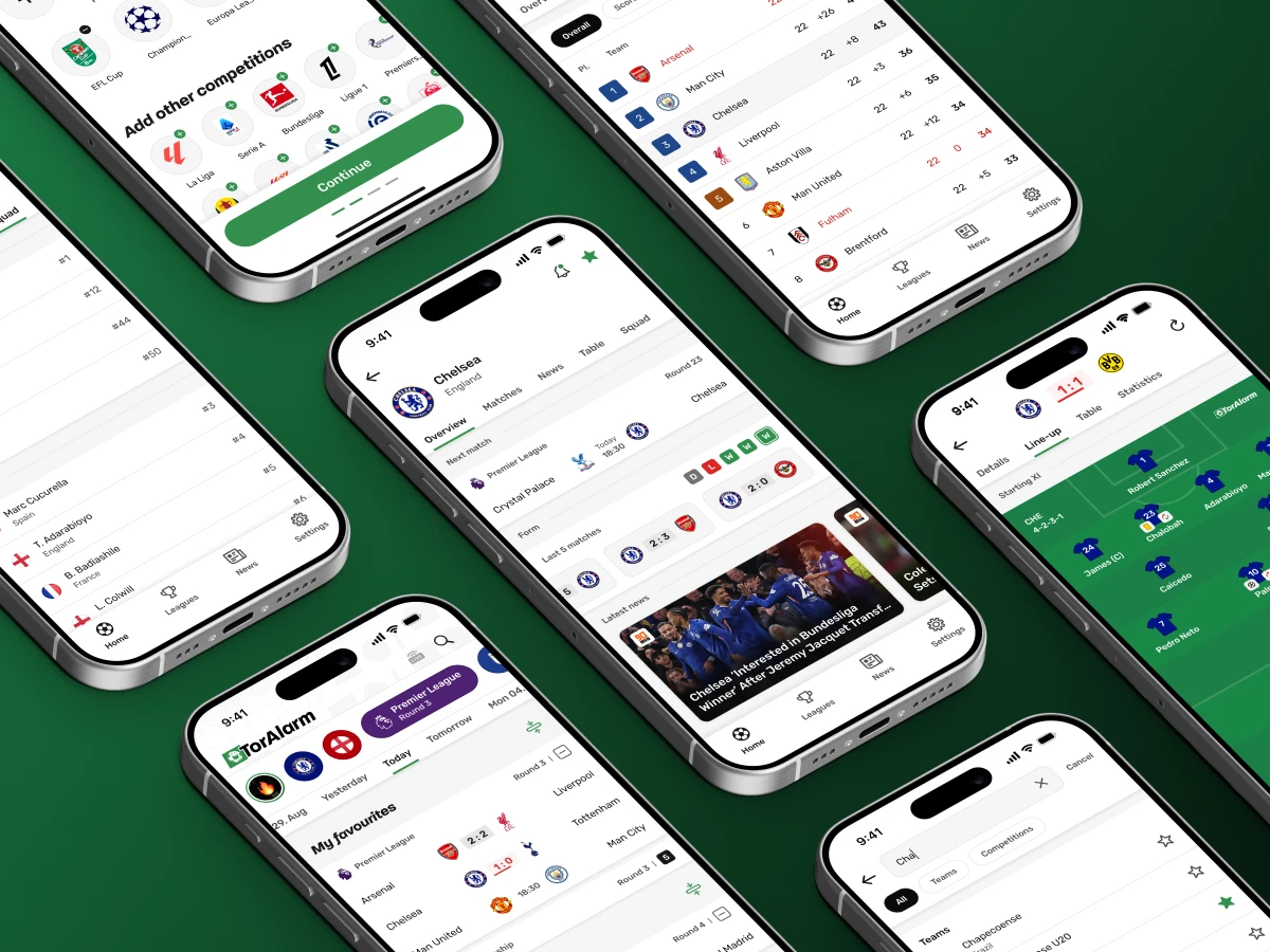
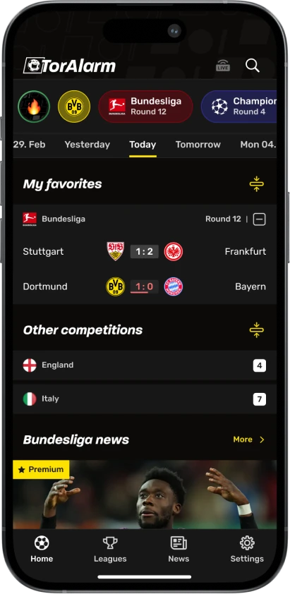
The existing home screen required constant manual updates and did not scale well. It relied heavily on weekly image changes, which created operational overhead and made the experience feel inconsistent. User feedback also showed that people wanted to see more matches directly on the home screen, without having to navigate between sections.
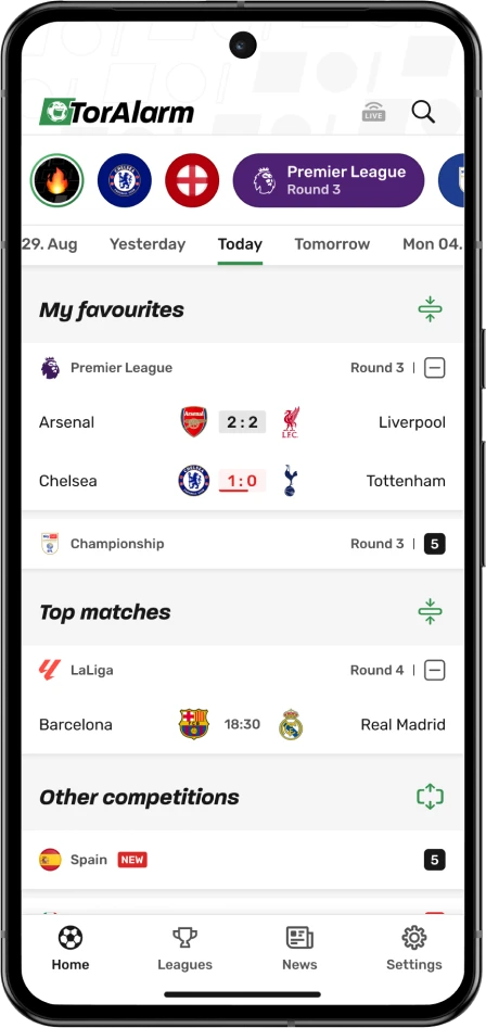
We made a larger structural decision. We removed the separate Today page from the bottom navigation and combined the Home and Today experiences into a single, updated home screen. One of our core goals was to allow users to access their favorite team or competition within a single screen tap.
We redesigned the home screen to be more data driven, scannable, and easier to maintain. The layout helps users instantly orient themselves and quickly reach the content they care about.
Favorite teams and competitions are now represented as chips using custom colors, making them easy to recognize at a glance and accessible with one tap. We surfaced all matches of the day directly on the home screen and grouped them into favorites, popular matches, and all matches, reducing unnecessary navigation.
To support different viewing habits, we introduced filters for live matches and swipe navigation between days. This allows users to quickly check live games, review matches they missed, or plan what to watch next.
As part of this redesign, we also rebuilt large parts of our design system. Many components were rethought and updated, leading to visual and interaction changes across the entire app. This helped create a more consistent and fresh experience and made it easier to scale new features moving forward.
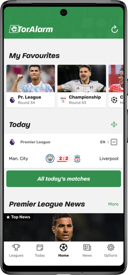
We intentionally kept news content below the match list. On days with fewer or no matches, the home screen remains useful rather than empty, giving users relevant football news to explore and maintaining engagement throughout the week.
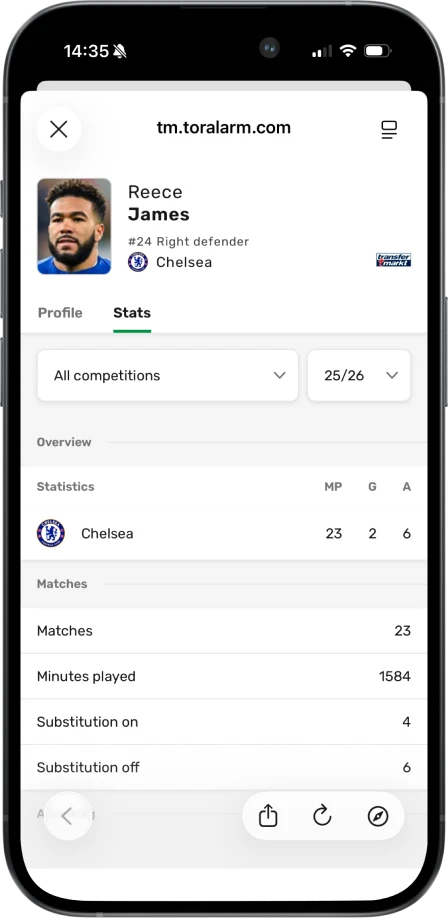
As the product evolved, we noticed a clear shift in the industry. Player profiles were becoming a standard expectation for football fans, especially for users who want to go beyond scores and results. Users feedback and competitive analysis showed that users often leave match apps to look up player information elsewhere.
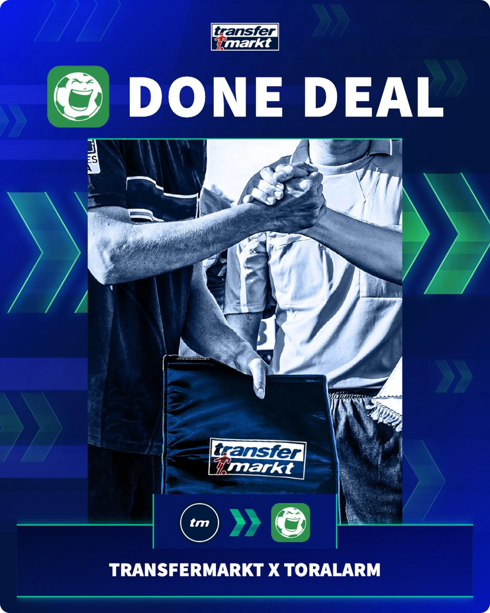
To address this, we collaborated with Transfermarkt, one of the most well known and trusted platforms for football statistics, player data, and market values. This partnership allowed us to introduce player profiles directly into TorAlarm with reliable and familiar data.
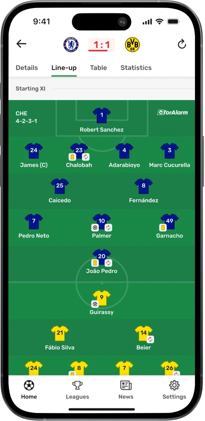
Player profiles are deeply integrated into the experience rather than treated as a separate feature. Lineups, match events, scorers lists, and squad lists all act as natural entry points, allowing users to open a player profile exactly when curiosity arises.
Profiles provide key information such as biography, career overview, statistics, and market value. This helps users follow their teams on a deeper level, understand player performance in context, and explore squads without leaving the app.
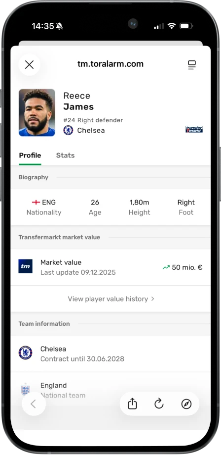
By keeping this information inside TorAlarm, we reduced the need for users to switch to competitors and encouraged longer, more exploratory sessions, especially during discussions with friends or when analyzing matches.
Previously, team related information was scattered across multiple screens. To find details about a team, users had to enter a competition first and then navigate through tables, match lists, or news sections. This made following a specific team time consuming and fragmented, especially for users who knew exactly what they were looking for.
To tackle this problem, we mapped the existing user flows to understand how fans followed their teams and where the experience broke down. We complemented this with competitor analysis and an online questionnaire, using direct user input to validate assumptions and guide the direction of the solution.
User flow of a user trying to follow his favorite team in our app
Users need to manually enable a notifications setting for their team every time they play in a new competition
Missing actual feature to follow their favorite team, can't make it official
Not possible to see the full squad, only what's shown in every match line-up
Can't read more information about players
Takes many clicks to follow their team's schedule in a tournament
Difficult to follow upcoming chosen team matches
Difficult to find news and videos about their favorite team
Ability to quickly turn on/off all notifications for the team
Team profiles changed a core behavior in the app. Before this, competitions were the main entry point and teams were something users encountered indirectly. We made teams tappable across the product. Lineups, match views, tables, and other high intent surfaces became entry points into team profiles. To avoid confusing existing users, we introduced this gradually using in app tooltips and small pop ups that explained what happens when you tap on a team. Instead of forcing a new pattern, we let users discover it naturally at moments where the intent was already there.
The overview screen brings together everything a fan cares about at a glance. Upcoming and previous matches, current form, table position, and key stats live in one place, one tap away.
This screen is also where notifications become explicit and intentional. Favoriting a team automatically enables notifications across all competitions, including newly added ones. This solved a major gap from the previous competition based logic, where users could easily miss important updates.
From a product and business perspective, this was a critical change. Team based notifications are more relevant, more timely, and easier to understand. That directly increased opt in rates for notifications, allowed us to send more meaningful pushes, and led to higher engagement and more page impressions. Better relevance meant better retention, and better retention meant a healthier business model.
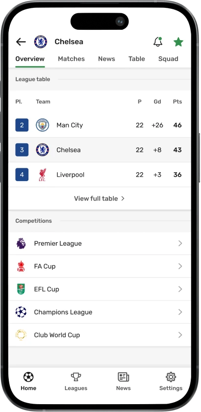
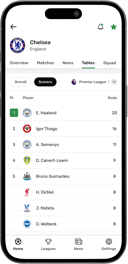
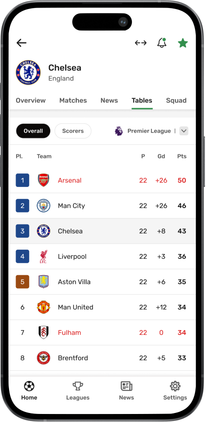
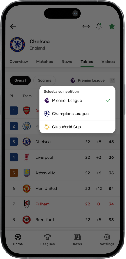
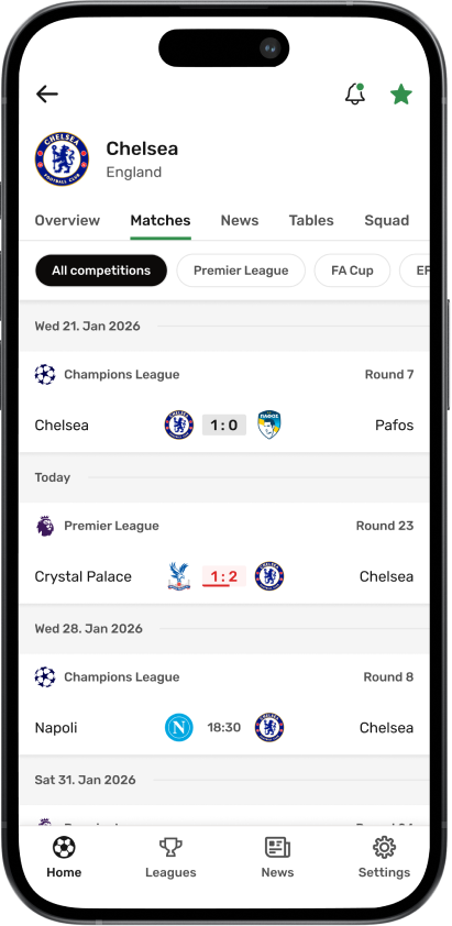
Teams rarely exist in just one competition. We designed standings and scorers to respect that reality. Within the team profile, users can quickly switch between competitions to see updated tables and top scorers without leaving the screen. This removed unnecessary navigation and kept the mental model simple. You are still following the same team, just through different lenses. The goal here was speed. Less searching. Less tapping. More focus on the team itself.
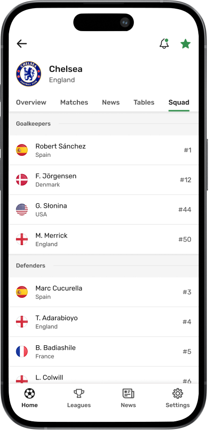
The team profile also became the home for team specific news, a full matches list, and squad details. Matches can be filtered by competition, which helps during busy weeks when teams play across leagues and cups. From the squad view, users can open player profiles and explore individual stats and career information. This connected team following with deeper player level exploration and reduced the need to leave the app for external sources.
At this point, the team profile stopped being a feature and became a destination. For many users, it replaced competitions as the primary way they experience football in the app.
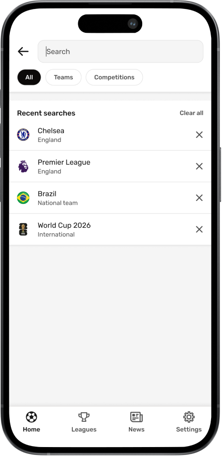
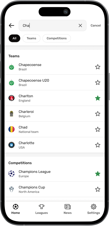
As the app grew, navigation became deeper and more complex. User research and feedback showed that finding a specific team or competition often required multiple steps, especially for users who knew exactly what they were looking for.
We introduced global search as a direct access point across the entire app. Instead of navigating through multiple screens, users can instantly find teams and competitions, jump straight to relevant content, and manage favorites from one place.
Search also allows users to favorite or unfavorite teams and competitions directly from the results. This makes it easy to quickly check whether the app includes a specific team or competition and personalize the experience without additional steps.
Recent searches support fast repeat access, which is especially useful for users who regularly check the same teams or competitions. By making search globally accessible and action oriented, we reduced friction in everyday navigation and gave users more control over how they move through the product.
Within the first year, 33% of users selected a favorite team, validating our approach to personalization and enabling more relevant notifications and a more tailored home experience.
Introducing onboarding created a clear entry point for personalization. Early retention improved by ~5%, as more users understood the value of the app and customized their experience from the first session.
We removed the separate Today page and merged it into a single home screen. The new home surfaces all matches of the day, alongside selected top matches, with the ability to switch between upcoming days. As a result, users returned more frequently to explore the app, even when their favorite teams were not playing.
By consolidating all team-related information into a single destination, users explored more content within one flow. Instead of navigating across competitions, they could access matches, standings, and news in one place, leading to a clear increase in page impressions and deeper engagement.
Global search allowed users to instantly find teams and competitions, removing the need for multi-step navigation. This made the experience faster and more intentional, increasing interaction with key content and supporting personalization through quick favoriting.
Adding player profiles created a more complete experience. By connecting players to lineups, match events, and squad views, users spent more time within match details and explored content more deeply without leaving the app.
Onboarding is intent capture, not a tutorial. Users engage when given a clear opportunity to personalize early. Personalization needs a front door.
Fans think in teams, not competitions. Designing around this mental model reduced friction and improved discoverability.
Structural change requires gradual introduction. New behaviors were adopted successfully through contextual entry points, not forced redesigns.
Visual quality builds trust at scale. Accurate logos and colors are not cosmetic. They reinforce credibility across thousands of teams and competitions.